You’ve finally found the home of your dreams. It’s in the right neighborhood, it’s charming, and it’s positively dripping with character inside and out. But what do you do when the existing architectural style isn’t a perfect fit with the pieces you see in furniture stores in Fort Wayne? Can your love for Mission style mesh with a gingerbread Victorian? Will the pair of Eames chairs handed down from your grandparents clash with a Craftsman bungalow? And what about integrating contemporary furniture? Those are good, and important, questions. So take a deep breath, relax, and turn to Fairfield Galleries for answers. As it turns out, it’s easier — and a lot more fun — than you’d think. It has less to do with style than with a few simple interior design choices that can help harmonize everything.
Frame
Think back to the last time you visited a museum, gallery, or even an antique shop. The paintings adorning the walls, often as not, were framed. And framing can be tricky to pull off; you want something that’s appropriate to the time period and the piece, but that sets it off without shouting it down. You’ll be doing the same thing at home, letting the framing — moldings, windows, and accent pieces — establish context for the art and furnishings. A bit of contrasting color can help the surroundings pop.
Conceal
Color has another role to play as well. Sometimes ornate trim can clash with simpler pieces. The sectional you love might seem out of place among too much filigree. Using a neutral color — or painting window and door trim the same color as your walls — won’t remove those features from view, but it does tone them down so the form and texture can “speak” more quietly. If, on the other hand, you don’t like the form at all, you can hide it altogether with drapes, or divert attention with wall hangings, photos, or art.
Zone
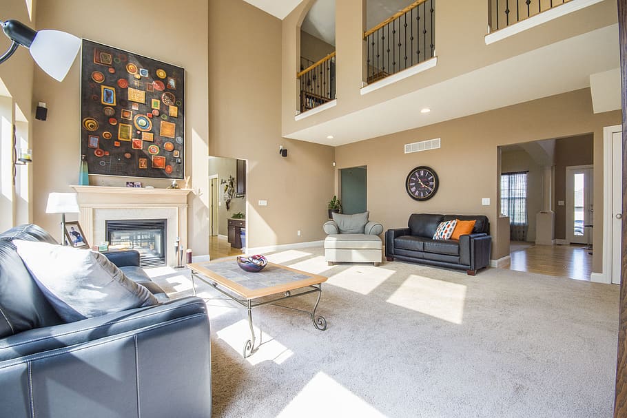
When is a room not a room? We’re not going Zen on you; sometimes a single large room, like a living room that opens onto the foyer, or an open plan that combines many purposes (kitchen, dining, and living) in an unbroken space can feel a bit boxy and undefined. Changing colorways from one area to the next using area rugs and taking advantage of furniture layouts can give each space its own clear identity, imposing order on irregularly-shaped rooms and making boxy spaces seem more intimate and cozy.
Mix (and Match)
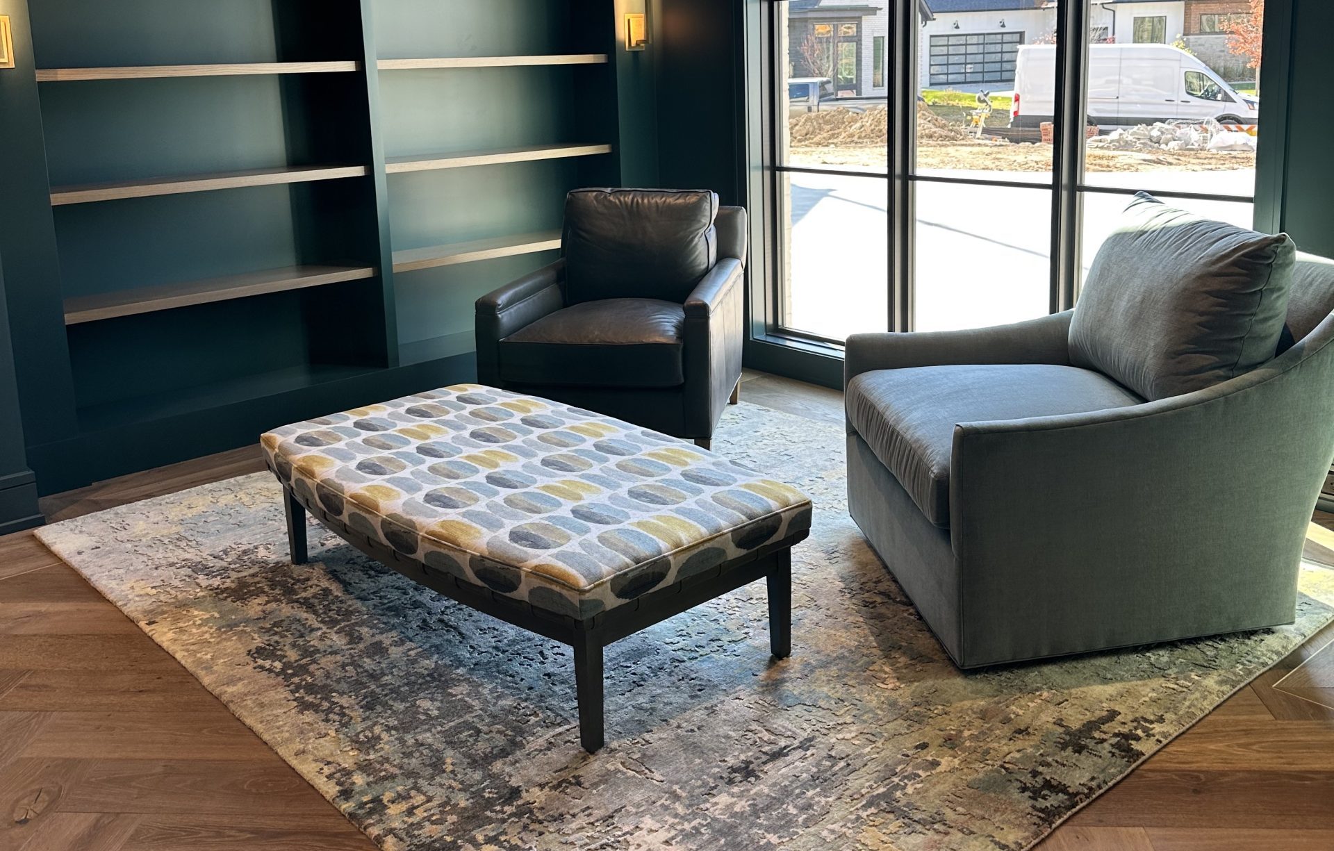
It can be fun keeping things period-correct, but it’s not always practical. Antiques aren’t nearly as cheap as they used to be. That’s the bad news. The good news is, unless someone is exceedingly picky, they’re not likely to notice if every piece in a room belongs to the same time period, style, or manufacturer. Like you, they’re more likely to notice how it all fits together.
Simplify
We’ve all seen rooms where there was just too much going on. And a room doesn’t even have to be cluttered to feel that way. So don’t feel as though every one of these techniques has to be used all the time, in every room; a light touch often works best. That said, don’t go to the other extreme; too much of one thing can be just as stifling, since it doesn’t lead the eye anywhere in particular or give it someplace to settle.
We know the old expression, “If these walls could talk…” But it’s not just the walls speaking. Your whole home, from your furniture to your collectibles, is telling your story. And for more than 70 years, Fairfield Galleries has helped our customers unearth and “tell” those stories better. Why not call us for an interior design consultation today?


